Creating a Shot Map
First, here is a link to the dashboard: https://public.tableau.com/profile/james.vaughan1697#!/vizhome/ChelseaStrikersShotMap/Dashboard1?publish=yes

I have decided that I will write a brief piece on any of the new dashboards I publish on Tableau. Hopefully it will give me the chance to explain the reasoning behind why I made certain decisions in the process and offer the opportunity for others to suggest potential improvements.
It will also allow me to provide a few tips on how to use certain features on the dashboard, and how best to get the most intuitive results which have the most actionable insights.
If anyone has any suggestions on if they would like to see any additional sections added to these articles feel free to get in contact with me.
Design
First I will have to offer a disclaimer that the design of this dashboard came from @datarobbie1 on twitter, and would largely be in a better position to speak on this then myself.
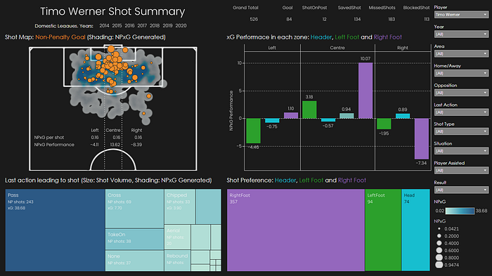
We had a quick discussion about the design and Robbie suggested that he was not convinced by the inclusion of the line graph as it includes data over time where as the others did not. I was conscious not to just add a replacement section for the sake of filling out the design, I believe adding the last action gives actionable insight into the type of service strikers receive and in combination with the other aspects on the dashboard gives the ability to drill down into what actions they are able to score from most consistently but also which actions generate the largest NPxG.
Functionality
One of the first features I looked to implement was the ability to switch between players with the data set I attached. From a performance point of view this would allow the analyst to cycle through opposition players to analyse there patterns without having to switch between individual dashboards per player. I think it also adds value from recruitment as it would enable the user to cycle through a selection of players that would include the teams current options and potential targets which would make it easier to see the difference in quality and preferences in shooting situation, if needed the dashboard could be opened ion two screen for a direct comparison.
The next step was to give the user the most options possible so that they could tailor the information displayed to their specific needs through filters various aspects such as last action, area of the pitch, shot type and situation which would be a good filter to use if you wanted to focus on a certain scenario such as corners.
Tips/Lessons learnt in creation
What I really liked about Robbie’s design was it was a reminder that just because you can doesn’t mean you should. And my previous iteration of a shot map is probably a good example of this, following the realisation that I now had the ability to plot plot shots in a X,Y format the intent was to show everything this way. In reality it’s just a bit of a bulbous mass with little actionable insights and that my presenting those detailed components in the other formats it’s much easier to interpret and allows you to aggregate to build a rounder picture with genuine insights.
Second lesson was sometimes to be channel your inner Allardyce and look for the most simplistic solution. For me I wanted to remove penalties from the visual as I think they would have the potential to skew performances, after taking a while to intricately filter these out in Tableau the far more effective solution was to just remove those few shots in excel before I attached the sheet to Tableau.
My last tip for this graphic would be to work with what you have, I think waffle charts are great and easily readable to see what section is bigger more so then the tree-maps I have used. But they are far harder to great and adding a label to the tree-maps makes them equally as easy to read especially if two of the shapes are very similarly sized.
Potential ideas for the future
I will look to find a solution to benchmark the size and colour to be fixed as currently this could cause inconsistency across dashboards as the shading/size will not be exactly the same as currently is dynamically adjusted to what is being displayed on the dashboard. The current issue is balancing that how if they were fixed would affect the usability of individual dashboards
Round-up
I am relatively using these articles as much for myself to remain consistent across my dashboards and remind myself that functionality and insights need to be the key driver. But it would be great if they could have value for others so let me know if there is anything you would suggest improving. They will definitely also be more valuable on dashboards that are less user friendly as my Tableau skills are not perfect and a few have a couple of unorthodox features that might need explanation to understand how to work.
As always best way to contact me is via ‘@ing’ me or direct messaging me on twitter @Advt_played
